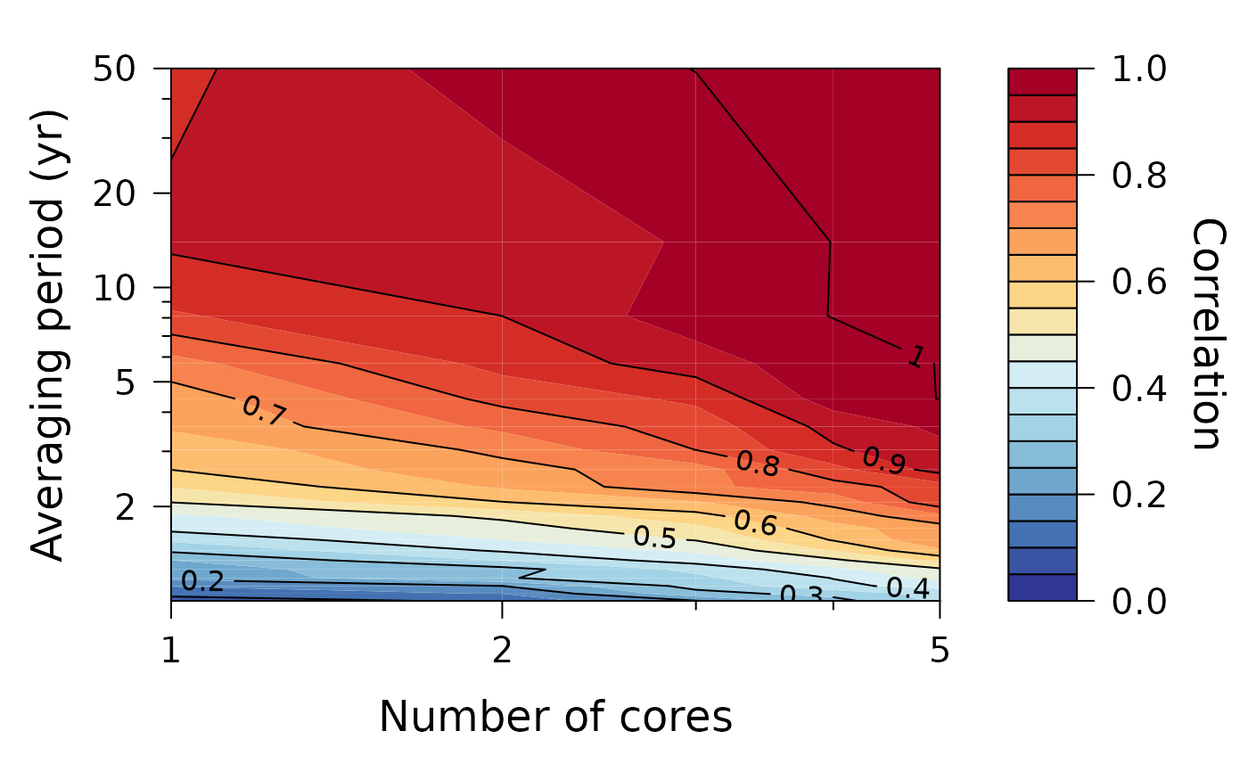
Plot the correlation of the spatial average of a certain number of proxy records with the underlying common signal depending on the number of records averaged and their temporal resolution (e.g., as in the firn core analysis of Münch and Laepple, 2018, Fig. 4).
Usage
PlotStackCorrelation(
  data,
  col.pal = NULL,
  label = "",
  xlim = NA,
  ylim = NA,
  xlab = "Number of cores",
  ylab = "Averaging period (yr)",
  xtm = NULL,
  ytm = NULL,
  xtl = NULL,
  ytl = NULL,
  xtm.min = NULL,
  ytm.min = NULL
)
Arguments
- data
a list of the correlation data (e.g. as output by
ObtainStackCorrelation), which must have two elements:freqandcorrelation, wherefreqcontains the frequency axis of the underlying proxy dataset (to obtain an axis for the temporal averaging period), and wherecorrelationis an * mmatrix of the correlation values. The number of columns ofcorrelationmust match the number of frequency values (i.e. the length offreq), and the row index stands for the number of proxy records averaged.- col.pal
a color palette function to be used to assign colors in the plot; the default
NULLmeans to calculate the palette function internally from ten colours of the divergingRdYlBupalette in the ColorBrewer 2.0 collection.- label
an optional label of the dataset to be displayed at the top of the plot.
- xlim
the x limits (x1, x2) of the plot. Set to
NAto use default limits calculated from the x data range, or supply a numeric vector of length 2 with custom limits. In the latter case, setting either of the elements toNAresults in using the default limit for this element only; see the example.- ylim
as
xlimfor the y limits of the plot.- xlab
x axis label.
- ylab
y axis label.
- xtm
x axis tick mark positions; default setting (
NULL) usesc(1, 2, 5, 10, 20).- ytm
y axis tick mark positions; default setting (
NULL) usesc(2, 5, 10, 20, 50).- xtl
x axis tick mark labels; if
NULLdetermined automatically fromxtm, else it must be a vector of labels of the same length asxtm.- ytl
equivalent to
xtlfor the y axis tick mark labels.- xtm.min
x axis minor tick marks; default setting
NULLuses minor tick marks that are adapted to the default x major tick marks. Set toNAto omit minor ticks at all.- ytm.min
as
xtm.minfor minor y axis tick marks.
References
Münch, T. and Laepple, T.: What climate signal is contained in decadal- to centennial-scale isotope variations from Antarctic ice cores? Clim. Past, 14, 2053–2070, https://doi.org/10.5194/cp-14-2053-2018, 2018.
Examples
# create a toy correlation dataset, which mimicks an increase
# in correlation with timescale and with the number of cores
# averaged, and plot it:

nf <- 20
nc <- 5

data <- list(
  freq = seq(0.01, 0.5, length.out = nf),
  correlation =
    matrix(seq(0.05, 0.9, length.out = nf), nrow = nc, ncol = nf,
           byrow = TRUE) +
    matrix(seq(0, 0.3, length.out = nc), nrow = nc, ncol = nf) +
    matrix(rnorm(nf * nc, sd = 0.02), nrow = nc, ncol = nf)
)
data$correlation[data$correlation > 1] <- 1
data$correlation[data$correlation < 0] <- 0

PlotStackCorrelation(data)